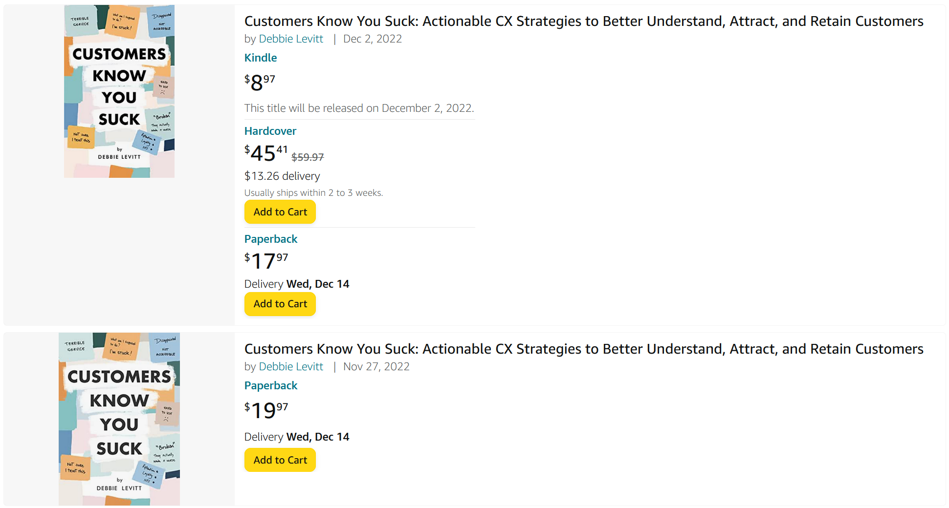
There appear to be two paperbacks, one $2 more than the other. People were confused, and messaged me to ask why one was more expensive.
In KDP, Amazon’s system for authors and publishers, the more expensive book was marked as a large print format. But this is not visible or obvious in any way to the shopper.
- There is no badge on the cover image marking the large print version.
- There is nothing in the search results to signal which, if any, might be large print.
When I raised this to KDP support, I was told that this isn’t a problem because shoppers will click on the title to go into the detail page, read more, and notice when a book is large or regular print.
No they won’t. Why would they? They might be confident they are looking at the right book, and just Add to Cart like Amazon wants them to do.
While I was trying to decide how I would fix this – since it’s evidently up to me to fix – I received this private message on LinkedIn:
I sold 30 large print copies in the first days the book was on sale. Could there really be that many people wanting large print? Were people buying it by mistake? Would they be unhappy with it, return it, and then Amazon will think that people don’t like my book?
I decided that the best way to fix it was to add (Large Print) after the book title, before the subtitle. Having a different book title is a huge disadvantage to me. Amazon won’t link it to my other formats for the same book, so:
- The large print book won’t be available on the same page where the other formats are listed. People might think there is no large print format.
- People who land on the large print book listing won’t see a Kindle or the smaller print hardcover or paperback.
- Ratings for the books will be divided on different Amazon listings. People seeing the large print book won’t see ratings and reviews left for the Kindle, hardcover, and other paperback.
- Amazon’s search results will still be less clear than they could be. There is still no badge on the large print making it clear and eliminating possible mistakes. People glancing quickly might not understand why there are two different results with different prices.
This situation doesn’t benefit the author. It’s not good for book shoppers. One might imagine that this is the way the Amazon site works because it benefits Amazon in some way. But failing to clearly mark a large print book offers no benefits to Amazon.
Situations like these are normally due to how the UX team or practitioner(s) work on a project. They are sometimes told what to design, and their cross-functional team isn’t interested in their warnings, concerns, or the potential Customer Experience problems they point out. They are sometimes not qualified or skilled enough; a team might have hired someone for their artistic skills without considering whether they are good at finding, predicting, or solving problems.
In addition to needing to solve this for book shoppers and authors, Amazon should be looking at the UX practitioner or team assigned to this area of the site. Someone should go into the archives and look at the project that involved large print books, and how those would be shown on the site.
Review how decisions were made. Did someone suggest that the large print book cover image get a clear badge but that was overruled? Did anybody consider how the large print would look in search results? Was there consideration for how a large print paperback linked to other formats would be clearly marked so that it doesn’t look like there are two identical “paperback” versions?
